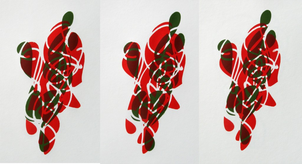
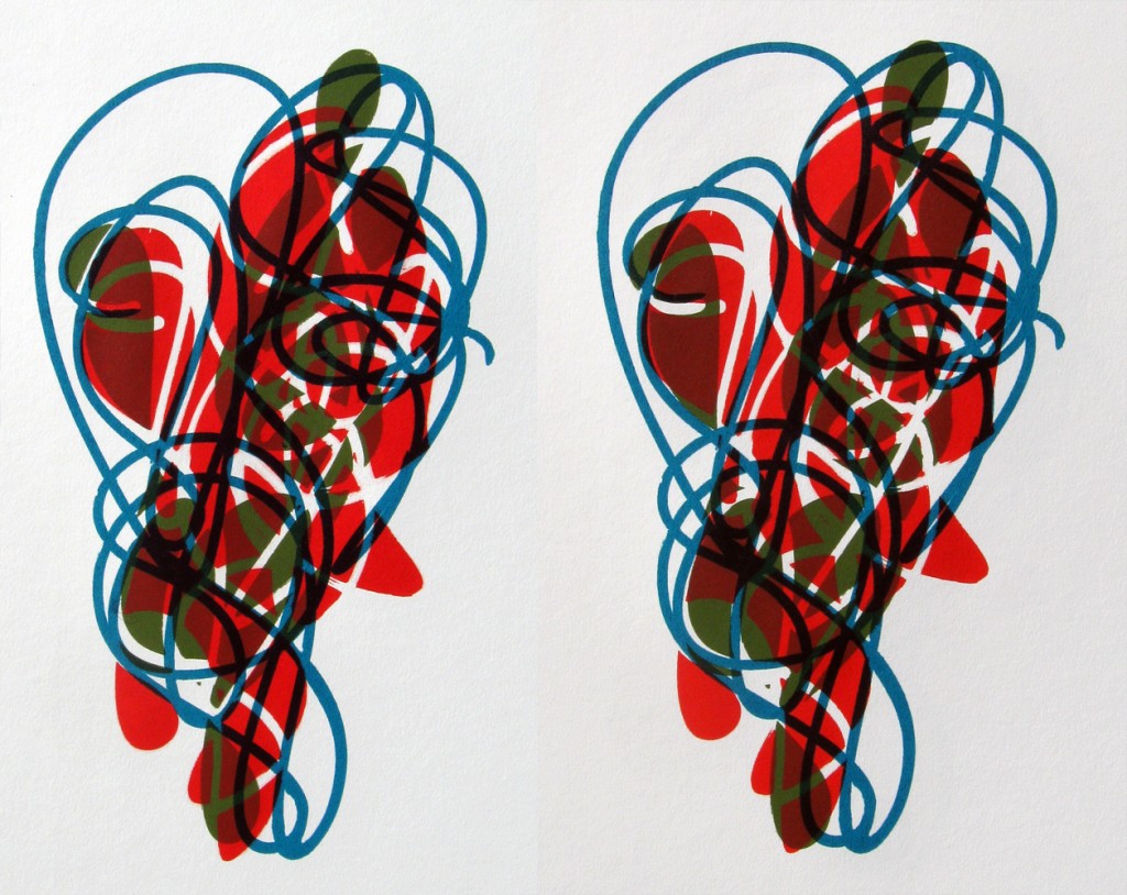
This set is building off of the negative space prints I did for “This& That” but in the larger format. Those prints were 11″x14″ and these are all closer to 18″x24″. Here is a set of three in orange and green with slightly different registrations:
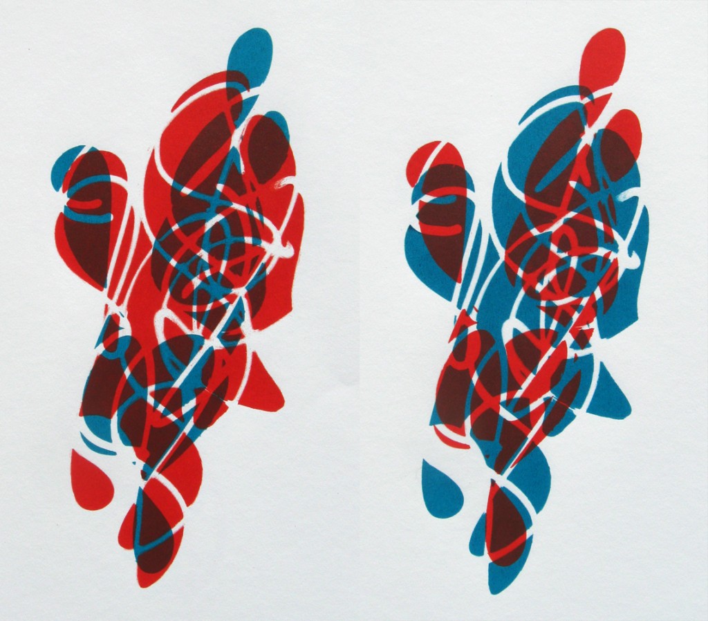
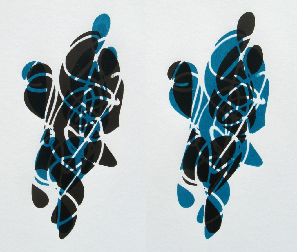
So far in my print experiments this year, the 2 and 3 color iterations have been the strongest. For this set I used 3 screens, two negative space iterations and one line. The two negative space screens happen to fit together really well in this set and I was able to get a lot of great variations. Slight differences in registration of the screens can have subtle but distinct effect on the look of the expression. I like how this echoes the chaotic variation in my drawings, small differences in proportion and distance of line changing how the expression manifests. Here are a few more color variations with just the negative space and a few opposite pairings:
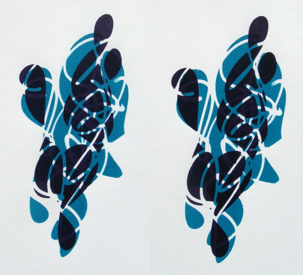
03-11-12 two versions of Two Figures in Purple and Turquoise - Each of these prints has slightly different registration.
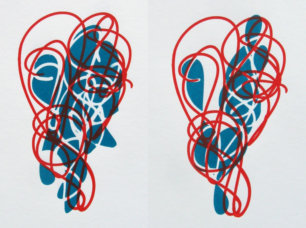
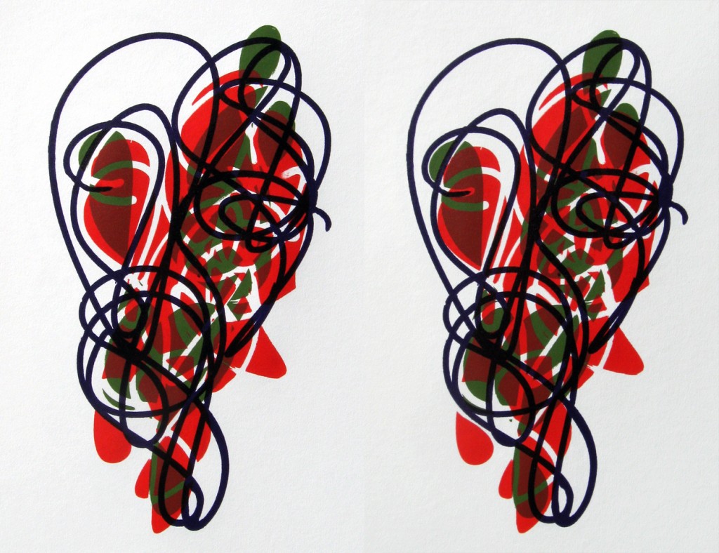
I mentioned above that there was a third screen with the line. Here is a split variation, the same line paired with one each of the negative screens:
Now for all three elements:
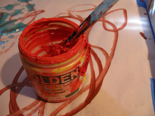
The color I have been referring to as “orange” in this post is a mixture of Hansa Yellow Light and Napthol Red Light. Against the turquoise it is almost electric:
