So after the great reception I got for the Number 24 Prints in November, I resolved to make more prints in the new year. Specifically new prints, not just reprints of my older work, although I probably will do a few of those too. I originally had this plan to do crazy complex designs from a very complicated drawing, but the drawing fluid does not handle like paint and I found that the results were not optimal. So I chose to paint new designs directly onto the screens and experiment with overlays, similar to my recent multi-linear paintings. The even application of ink in the silkscreen process will allow overlays of color that I currently avoid in my paintings. When painting I usually aim to apply color in opaque layers, so that each color is fully saturated in the areas I designate. Rarely, if ever, do I allow transparent overlays. One of the things I have noticed, particularly with some of the more transparent colors I use (specifically yellows and greens) is the difference in appearance between layers, some colors not achieving full saturation until 5 or 6 layers. This was an element I hoped to explore in the prints. Specifically I wanted to do several yellow-only and green-only prints to examine the more saturated overlaying sections.
As I mentioned, the drawing fluid I used for the last run of prints was good enough for the relatively thick line of Number 24. It is the consistency of maple syrup though and does not easily make long straight lines of uniform thickness like I use in my more recent paintings. Part of the problem is that it needs to be laid on thick in order to block out the screen filler. A light single layer will not suffice and result in a completely filled in screen. After several failed experiments I ended up fashioning a makeshift squeeze marker out of an old Golden fluid bottle. It took a little practice to get used to but the results ended up looking like this:
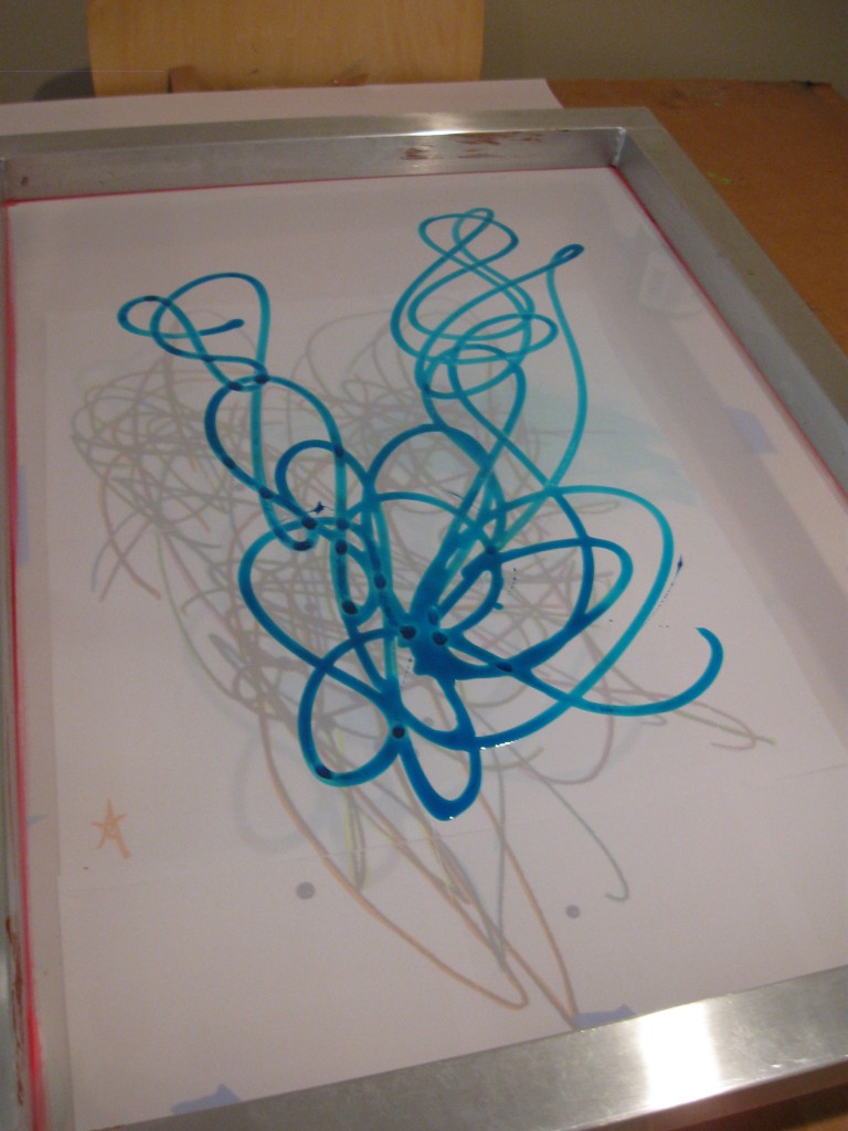
Drawing fluid on screen
After a little trial and error, and washing out the screens I didn’t like I had 5 screens drying in my hallway.
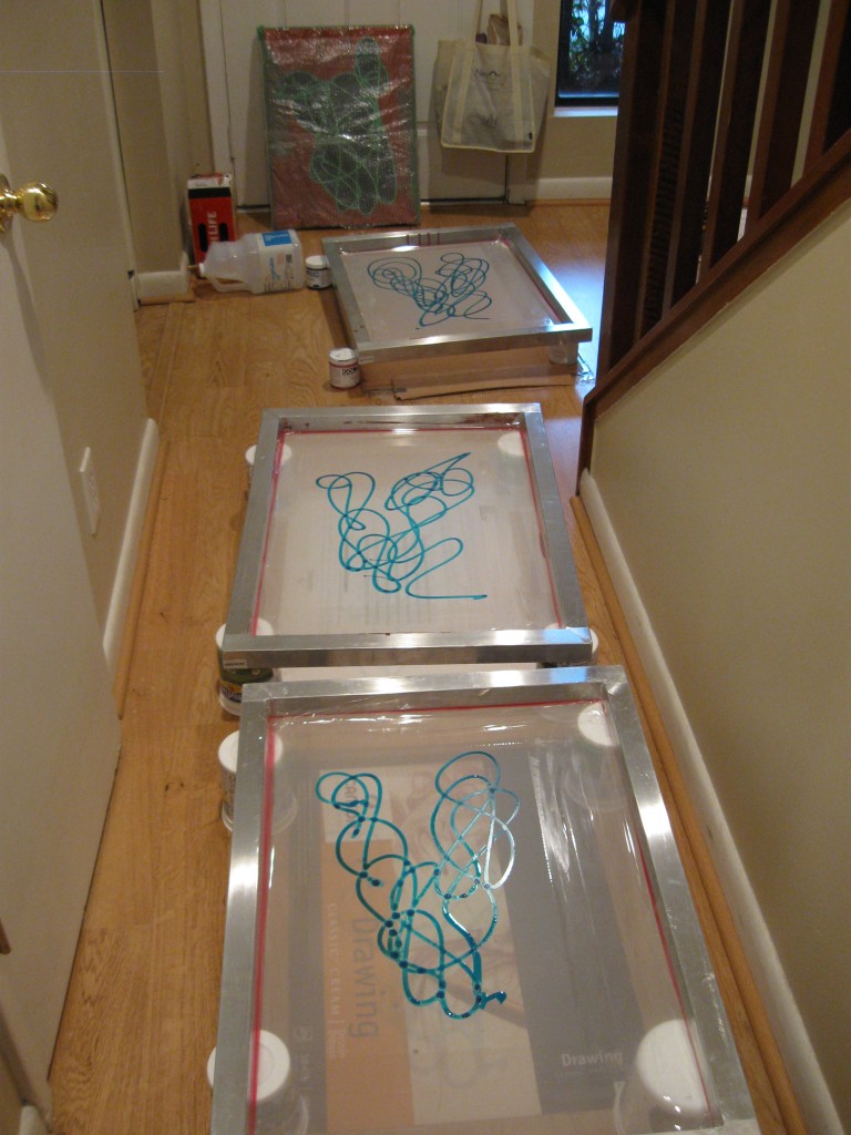
Screens drying in the hallway
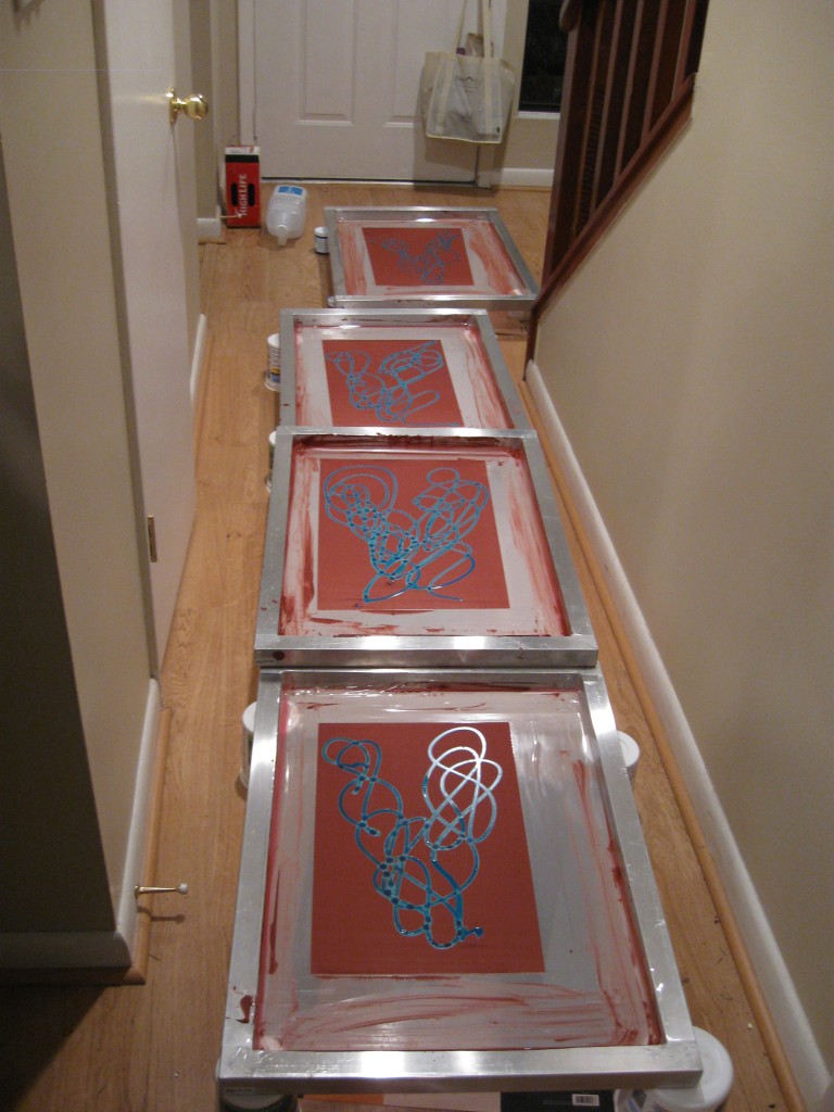
I recommend having this mess cleaned up before the spouse returns home
Then tape the corners and add the screen filler. Rinse. Dry. Finally ready to print.
I did several color combinations. First 4 layers of green. This really emphasizes the overlay effect:
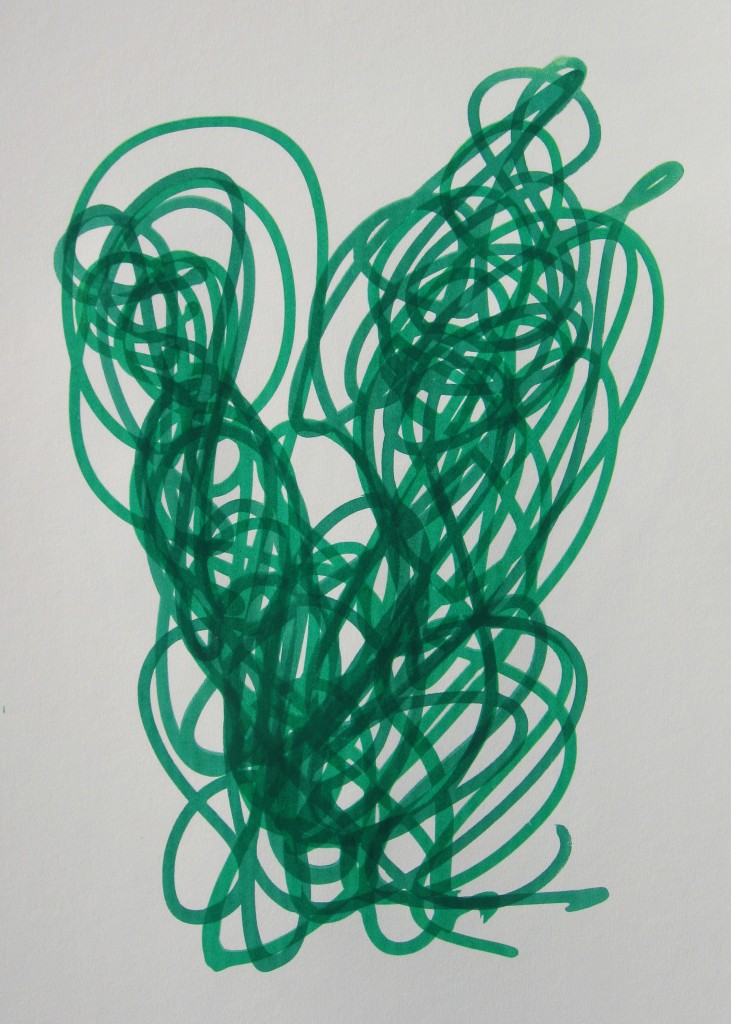
4 layers of green
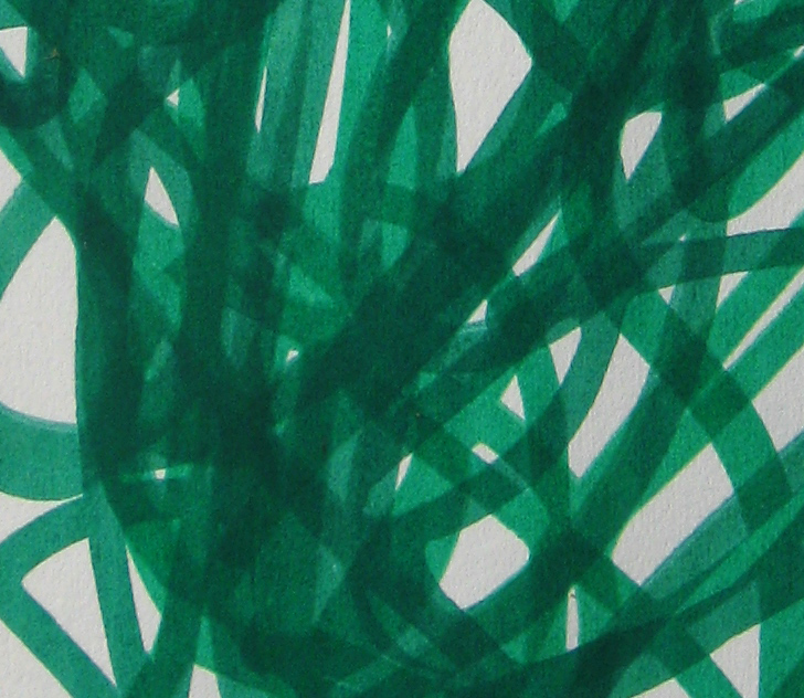
4 layers of green close up
Now with with 3 yellows:
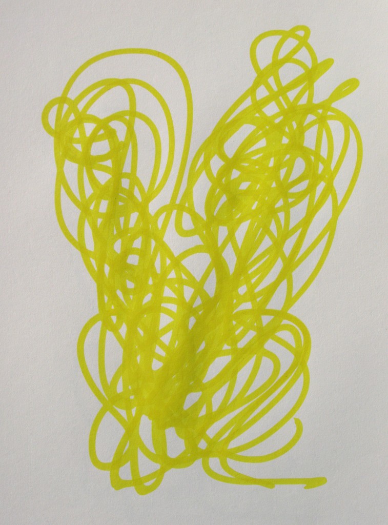
3 yellows
This is definitely a more subtle overlay effect. It is nearly impossible to see the separate layers from any distance. Up close, however you can see changes in saturation at the overlay:
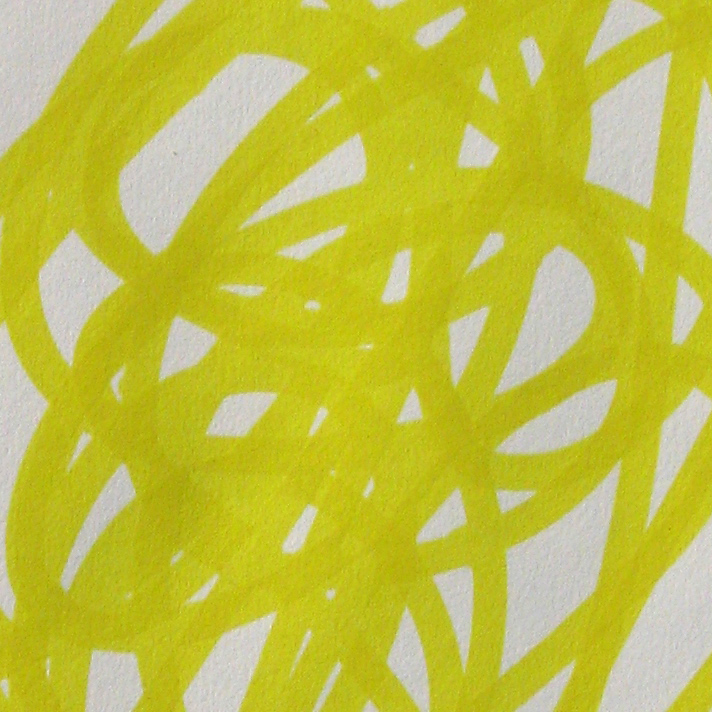
3 yellows close up
Here are some multi-color variations. These two both have multiple layers of yellow one above and one below the first layer of green:
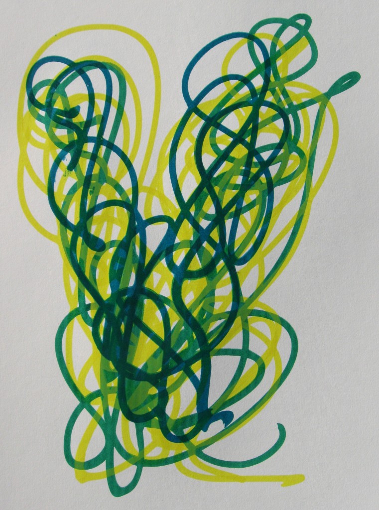
Yellow, green, yellow, turquoise
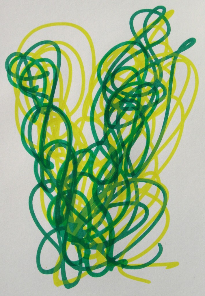
Yellow, green, yellow, green
Here is one with 2 shades of green, one a full green and one a mixture of yellow and green. this is actually 1/3, one of the few where I made multiples of the same color combination:
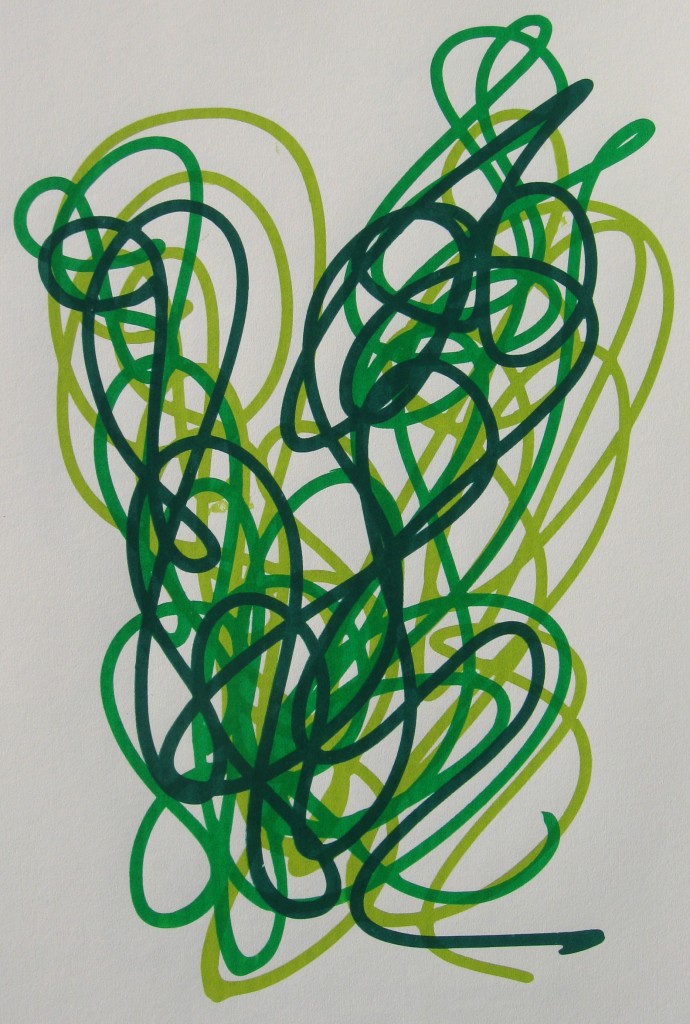
Yellow, 2 greens
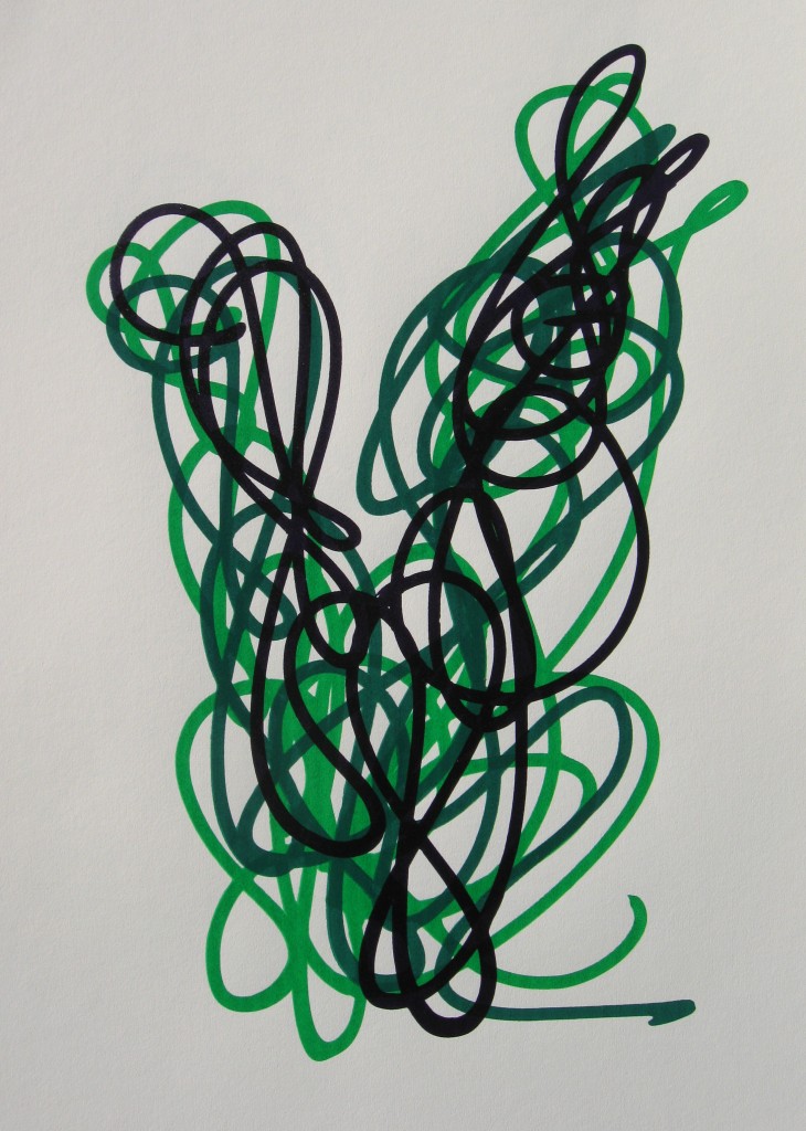
2 greens, purple
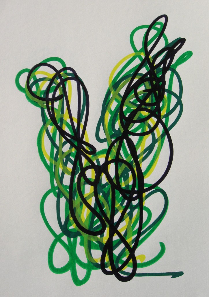
Yellow, 2 greens, purple
For the most part these were made with Hansa Yellow Light, Phthalo Green (Yellow Shade), Turquoise (Phthalo) and Dioxazine Purple.
Check the Prints page for more. Most of these are 1/1 with no direct duplicate. There are a few multiples too, but they are really only multiples in intent as each has a slightly unique registration. They are not all perfect as I am still getting used to this method and making plenty of mistakes along the way, but I am learning to be okay with that. I spent a good deal of yesterday reclaiming the screens, so the next set of prints will be all different designs.