New Paintings

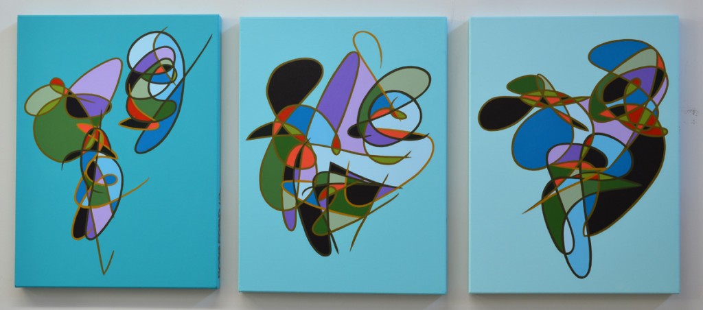
Three new paintings to post.  I have been working on these for awhile, about a month I guess. There have been a couple things going on but more on that later.  I will be posting about some new drawings too shortly.  The next pieces will be really big again, but I wanted to get a few small ones done before I got caught up in a big project.  I have sketched a whole book so far in preparation for these next large pieces and these were 3 faces caught my eye but were better suited to this smaller size.  …
New Painting – Number 427

So I have finally finished this painting (the orange one), Number 427.  Anyone who has come by my studio during June and July has seen this thing in various stages of completion.  Here are some progress shots.…

Orange!

There are two sets of prints here.  This first set was printed on 4/15/12.  The full array is up on the Prints page.  This first group uses 3 shades of turquoise, in different color iterations:

To get all of the variations I printed each screen twice in each color, then switched colors and repeated on the dry prints for each of the remaining screens.  I started printing the lightest shade, adding more turquoise for each layer.  Phthalo turquoise is one of my favorite colors. …

New Paintings: Process

Here are some start-to-finish progress shots of Number 424 and Number 425.  I started these March 31st, the day after the auction preview at NCMA.  I am still playing with the same colors as I used in 423 but I have added a lighter orange, moved the orange inside and I am using 2 blacks (one turquoise, one blue) each with gray variant.  The exteriors are white shades of the two minor colors, chrome oxide green and van dyke brown. …

3/26/12 New Painting

Hard to believe it’s the end of March and this is the first painting of 2012, Number 423.  I have been focused on the prints since January so I haven’t spent much time actually painting.  It’s been a lot of fun but I needed to paint.  I am still planning a giant painting on this roll of canvas I have.The plan has been to go very heavily multilinear on that since I will have space to put a lot of lines.…

Negative Space Prints

This set is building off of the negative space prints I did for “This& That” but in the larger format. Those prints were 11″x14″ and these are all closer to 18″x24″.  Here is a set of three in orange and green with slightly different registrations:

So far in my print experiments this year, the 2 and 3 color iterations have been the strongest. For this set I used 3 screens, two negative space iterations and one line. The two negative space screens happen to fit together really well in this set and I was able to get a lot of great variations. …

More prints

I am continuing to experiment with screen printing. Now that I have the process down I am free to make more directed experiments with colors and overlays.  I have found that 2 and 3 color variations work best.  4 and 5 colors seems to be too much for my current figures.  Here are some of my more successful two-color variations:


Three colors:

The green went down first, then the brown finally the translucent red.  Because the purple is so dark there is only an overlay effect from the red. …

The Prints are Ready

Silkscreen Printing is a technique I learned back in 1994 at Saint Paul Central High School.  I was entering 10th grade when my family moved from southwestern Minnesota to St. Paul that year.  The graduation requirements at Central (which we students referred to as CenTRO) were different from those at the school I came from.  This difference eventually allowed me to graduate early, but more on that later.  I had already taken “Art” and could not take it again for some reason when I was enrolling. …